Misc
Visualizing Human Evolution with a New Ancient Human Species
A New Member of Human Evolution
The next step in understanding human evolution has brought forth the reclassification of some old names.
Mirjana Roksandic, Predrag Radovic, and their team of researchers propose a new human species called Homo bodoensis.
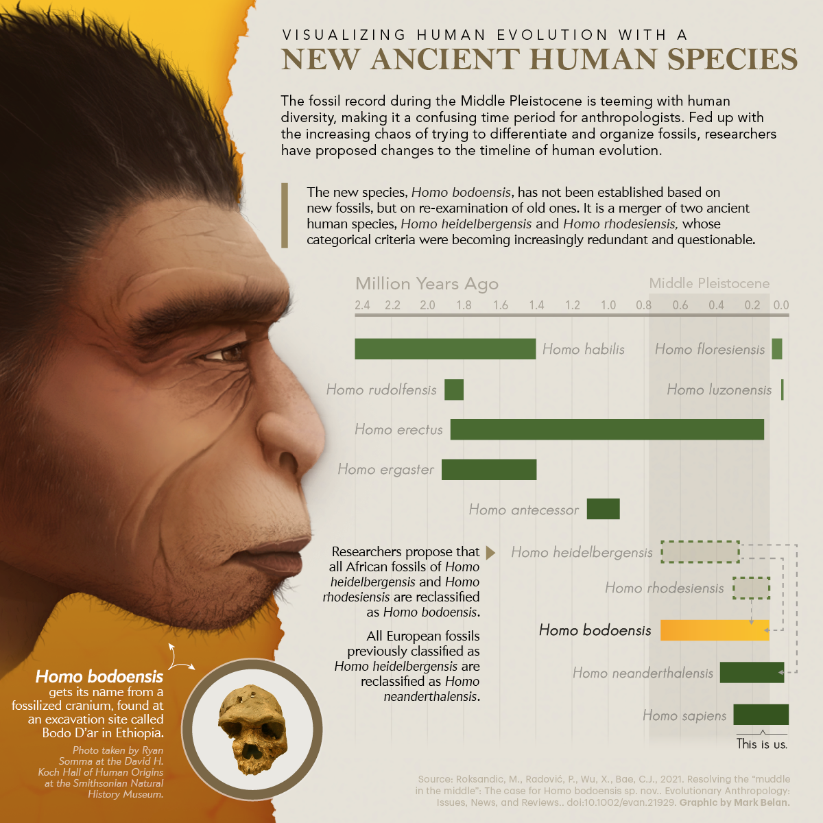
H. bodoensis isn’t a discovery of new fossils but a re-examination of old ones. This reclassification is an attempt to clean up long-standing confusion about our ancestors and how humans evolved.
The Muddle in the Middle
The Middle Pleistocene was a period spanning 780,000 to 126,000 years ago and had a lot of different human species existing at the time. These species included:
- European Neanderthals (Homo neanderthalensis)
- Asian Denisovans
- African Homo heidelbergensis
- African Homo rhodesiensis
- African Homo erectus
The Middle Pleistocene was a lively time for human evolution, as it eventually spawned our species, Homo sapiens. Despite this bountiful presence of activity, our knowledge of human evolution during this age is lacking. This problem is known as “the Muddle in the Middle.”
Age-Old Thinking about Human Evolution
Human fossils from the Middle Pleistocene in Africa and Eurasia are usually classified as either Homo heidelbergensis or Homo rhodesiensis.
Homo heidelbergensis
H. heidelbergensis is an extinct species of human whose first fossil was found in a gravel pit in Germany in 1907. Since then, new-found fossils that did not fit the classification criteria of Neanderthals, H. sapiens, or the older H. erectus have been classified as H. heidelbergensis.
Roksandic and her team argue that this ‘lumping’ is a misattribution that muddles our understanding of which species H. sapiens originated from.
In addition, newer DNA evidence suggests that some H. heidelbergensis fossils from Europe originated from early Neanderthals. The name is, thus, redundant.
Homo rhodesiensis
Some believe that H. rhodesiensis is an extinct species of humans and the most recent ancestor of H. sapiens and Neanderthals.
Despite its importance, it never gained popularity in the paleoanthropology communities. This is because of its poor definition, but Roksandic supports its removal because it is also an alleged namesake to Rhodesia’s violent and aggressive colonizer, Cecil Rhodes.
It was high time for both H. heidelbergensis and H. rhodesiensis to go.
Homo bodoensis and What Changes in Human Evolution
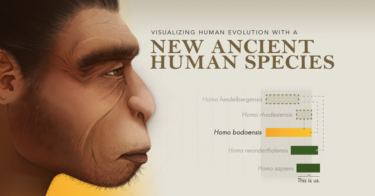
Roksandic and her team suggest dissolving the two species to introduce a new merged species, H. bodoensis. The name derives from a 600,000-year-old skull discovered in 1976 in Bodo D’ar, Ethiopia.
All fossils previously classified as H. heidelbergensis and H. rhodesiensis originating in Africa are reclassified as H. bodoensis. As such, this now makes H. bodoensis our direct ancestor.
Fossils from Western Europe are reclassified as H. neanderthalensis to reflect the early appearance of Neanderthal-like traits. Asian fossils, like those from China, may belong to a different lineage.
A Doubted Legacy?
Despite its merits, not everyone agrees with this new proposal.
Renowned anthropologist Chris Stringer from the Natural History Museum of London says that the reshuffling of species is unnecessary.
While he agrees that the name H. heidelbergensis is used too loosely and should be confined to a few select fossils, he is happy to continue using H. rhodesiensis. He argues its namesake comes from the country, not from Cecil Rhodes himself.
In addition, Stinger says there are a variety of other species names to choose from before creating a new one. If H. rhodesiensis must be renamed, species like Homo saldanensis, named by Matthew Drennan in the 1950s from a fossilized skull, should take precedence.
Roksandic and her team reclassified H. saldanensis into H. bodoensis.

This article was published as a part of Visual Capitalist's Creator Program, which features data-driven visuals from some of our favorite Creators around the world.


Misc
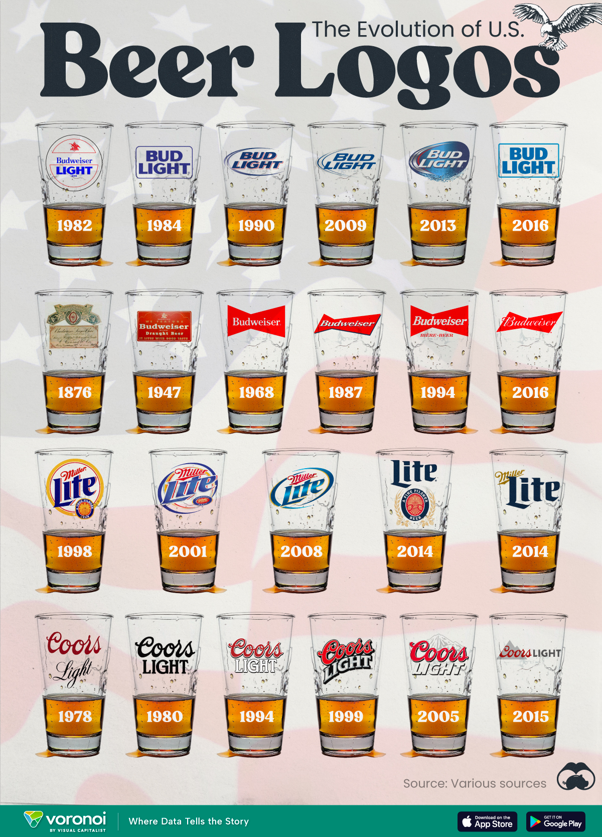
The Evolution of U.S. Beer Logos
In this graphic, we analyze the evolution of popular U.S. beer logos like Budweiser, Coors Light, Bud Light, and more.

The Evolution of U.S. Beer Logos
This was originally posted on our Voronoi app. Download the app for free on iOS or Android and discover incredible data-driven charts from a variety of trusted sources.
Despite selling a popular product, beer companies have to be creative to stand out in a competitive market.
In this graphic, we analyze the evolution of some U.S. beer logos based on various sources. We chose brands based on a mixture of criteria, including popularity (based on YouGov surveys), availability of logo assets, and those with interesting developments.
Bud Light Back to the ’80s
Despite recent backlash and calls for a boycott after sending a commemorative can to transgender influencer Dylan Mulvaney, Bud Light remains one of America’s best-selling beers.
The brand of light beer, owned by the Anheuser-Busch company, has switched from its more circular logo with italic letters adopted in the 1990s back to the Bud Light badge of the 1980s. It is composed of heavy uppercase lettering, written in two levels in a shade of blue with the inscription placed on a solid white background and enclosed in a thin rectangular frame.
Miller Lite Goes Old School
After following a similar approach to Bud Light’s branding throughout the 2000s, Miller Lite decided to undergo a major rebranding in 2014.
The company returned to its 1970s roots, once again combining a white can with its original blue, gold, and red logo. The redesign was largely considered a success, given that Miller Lite sales immediately increased following the change.
A Symbol of American Brewing
The oldest brand on our U.S. beer list, the Budweiser logo, has undergone more than 15 changes over the years.
The design of two connected triangles represents a red bow tie, as a symbol of American brewing.
The colors of the Budweiser logo include a vibrant red, which helps the logo stand out and be easily recognizable from a distance. Studies also suggest that the color red stimulates appetite. Meanwhile, the white inscription symbolizes purity and cleanliness.
Curious to learn more about the beer market? Check out this graphic about global beer consumption.

-

 Energy6 days ago
Mapped: The Age of Energy Projects in Interconnection Queues, by State
-

 AI2 weeks ago
Visualizing AI Patents by Country
-

 Markets2 weeks ago
Economic Growth Forecasts for G7 and BRICS Countries in 2024
-

 Wealth2 weeks ago
Charted: Which City Has the Most Billionaires in 2024?
-

 Technology1 week ago
All of the Grants Given by the U.S. CHIPS Act
-

 Green1 week ago
The Carbon Footprint of Major Travel Methods
-

 United States1 week ago
Visualizing the Most Common Pets in the U.S.
-

 Culture1 week ago
The World’s Top Media Franchises by All-Time Revenue