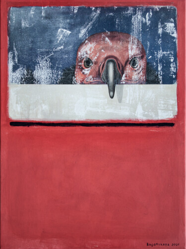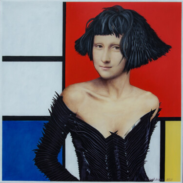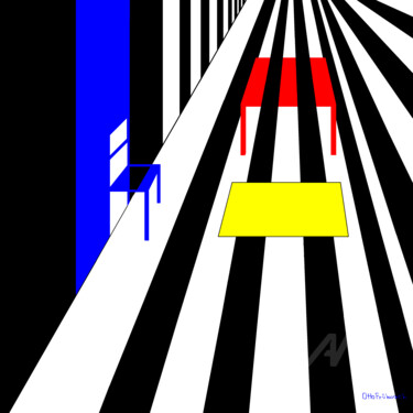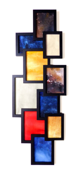
 Nataliya Bagatskaya, "Lisa visiting Mondrian-3", 2021. Acrylic / lacquer on canvas, 60 x 60 cm.
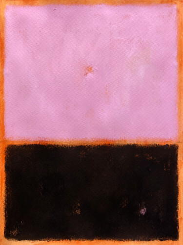
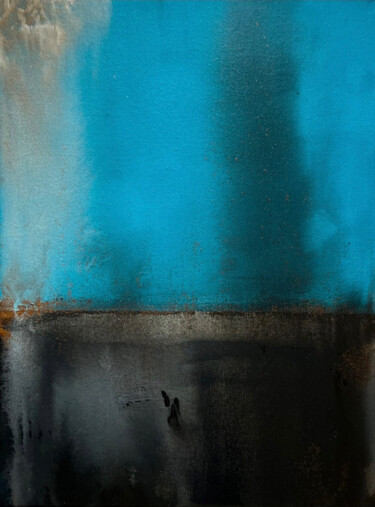
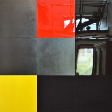
 Antonella Preti, Dreaming of Bauhaus, 2020. Acrylic on fabric, 60 x 60 cm.
The interpretation of an abstract work of art is, to the viewer, more complex and less intuitive than its figurative counterpart, so much so that if we look at a portrait, thanks also to the information drawn from its very title, it is possible to come to understand, both the identity of the effigy, and its relationship with the artist, a reason often behind the creation of the masterpiece itself. On the contrary, in order to appreciate an abstract painting at the deepest and most notionistic level, it is advisable to document and study it more thoroughly, in order to become familiar with its historical-artistic context of belonging and the creative process, which generated it, the result of the artist-artist's personal view of the world. What has just been stated is reflected in the analysis of Piet Mondrian's Composition with Red, Yellow and Blue (1929), for many, "blasphemous," a simple depiction of geometric shapes in color. In reality, the 1929 masterpiece tells a much deeper story, since it is the result of a linguistic quest, which the Dutch master conducted from about 1907, a time when he, having approached the spiritual discipline of Theosophy, adopted its philosophical principles, aspiring to the union of the universal and the individual, the inner and the outer, through the conception of chromatically and formally increasingly essential and balanced compositions. In fact, Composition with Red, Yellow and Blue, whose popular style, so dear to the designers, was conceived in the period between the two world wars, presents a careful distribution of vertical and horizontal lines, arranged on the support in order to obtain square and rectangular backgrounds of harmonious size, within which the three primary colors allude to a precise symbology: yellow is related to solar energy, red represents the union of light and space, and blue is associated with the spiritual sphere. In this context, the universal balance to which the artist aspires is well represented by the large white square, which, at the top, to the right of the support, is harmonized by the presence of the above-mentioned colored geometric figures, which are arranged in the different and opposite corners of the canvas. After this brief description, it is possible to understand the "related" works created by the same master, which can be placed in a time span from, roughly, the 1920s to the 1930s. Subsequently, in works such as Tableau I: Lozenge with Four Lines and Gray, the master's geometric style evolves to focus more on exploring the potential of the lozenge, diamond-shaped figure, which, by displacing the more classical orientation of the canvas, gives the lines contained within it the appearance of greater and indefinite extension. Finally, beginning in the 1940s, the artist, by then literally enchanted by the vitality of the city New York, a place intensely experienced to the rhythm of jazz music, reaches the concluding fasa of his work, marked by the asymmetrical distribution of brightly colored squares placed within yellow lines, aimed at synthesizing the rhythm of the aforementioned metropolis, just as occurs in Broadway Boogie-Woogie (1942-43). Also representative of this period is New York City 1, a 1941 painting that has recently been the subject of much media attention, as it has been exhibited upside down for over seventy-five years at the Kunstsammlung Nordrhein-Westfalen in Düsseldorf, Germany. This discovery, which bears the signature of Italian artist Francesco Visalli, amply demonstrates the thesis argued above: the interpretation of an abstract painting turns out to be, even today, more complex and laborious than that of a figurative work.

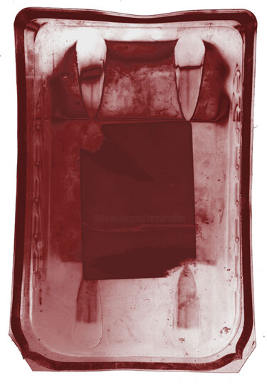
Dr. Matthias Kerling, Selfsimilar Mondrian squares, 2022. Digital art on paper, 50 x 50 cm.
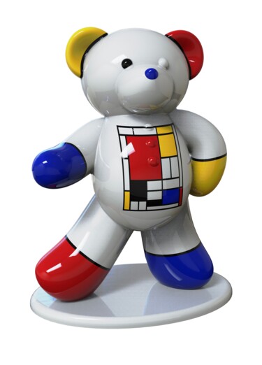
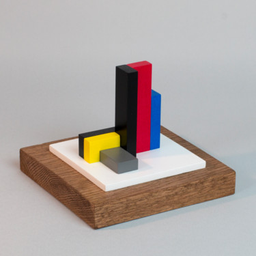
 Harouna Andre Guillabert Gacko, Ours Mondrian Pop art, 2022. Sculpture, resin / lacquer on other substrate, 45 x 35 x 23 cm / 1.00 kg.
Piet Mondrian: post-impressionist, luminist and cubist origins.
The Dutch master is best known for the aforementioned artistic investigation of a neo-Plasticist nature, although such a viewpoint was achieved by him only through a long and laborious "identity" search, which was not limited to being the result of purely philosophical orientations, as it was determined by a gradual cognitive process, taking place in the preliminary knowledge, and practice, of some earlier figurative currents, such as Post-Impressionism, Luminism and Cubism. Regarding the first movement, Mondrian was largely influenced, at the dawn of the twentieth century, by the work of Kees van Dogen, Otto van Rees and Jan Sluijters, Post-Impressionists who used color in bold ways, drawing strong inspiration from the work of Vincent van Gogh. The Dutch artist's experimentation, following the example of the aforementioned masters, can be summed up by the 1907 quick sketch, which, titled The Red Cloud, is marked by strong chromatic expressiveness. This point of view was enriched by his meeting with Jan Toorop, a Dutch exponent of Luminism, whose artistic investigation, tending toward the realization of light through a series of dots or short lines of primary colors, enchanted Mondrian, who, probably from that time on, became largely interested in the use of the aforementioned chromatics. Subsequent to the Luminist period and the spiritual influence of theosophy, the master became so close to the example of Paul Cézanne and the Cubist painters that in 1912 he moved to the French capital in order to follow more closely the work of Picasso and Braque. However, the precepts of Cubism in Mondrian's work were exhausted by the time of his return to his homeland, that is, in about 1914, when he took the aforementioned style to its extreme limits, to finally exhaust it with the founding of the De Stijl movement (1917).
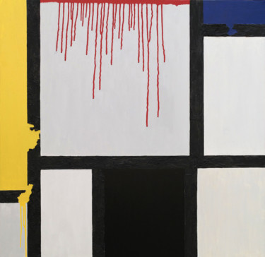
 Cécile Duchêne Malissin, Homage to Mondrian, 2015. Painting, pastel / pencil on canvas, 30 x 30 cm.
Cécile Duchêne Malissin: Homage to Mondrian
Malissin's painting represents an explicit homage to the work of the luminist Mondrian, who made clear his progressive stylistic evolution toward Neoplasticism precisely through the succession of masterpieces having trees as their subject matter, forming part of a series of the same name created between 1908 and 1912. In particular, the "realism" of the Artmajeur artist's work would "trace" that of Red Tree, a painting from around 1908, in which Mondrian began his process of synthesizing formal visual language through the elimination of traditional pictorialism, rendered by the conception of an essential composition, in which a tree, perfectly in the center of the support, is framed by the rectangle of the canvas. In addition, the simplification sought by the artist extends to the colors, such that he limited himself to the use of shades of blue, black, red and yellow. At the same time, despite the "minimalism," the elements of the narrative remain faithful to the real datum, so much so that the ideal line of a low horizon and the sky on which the tree with its trunk and branches stands out can be glimpsed. It is precisely these latter peculiarities that give the work stylistic features comparable to the work of Vincent van Gogh, with whom Mondrian shares a rich emotional interpretation of forms.
 Emmanuel Passeleu, Mondrian airplane, 2022. Digital photograph, 50 x 50 cm.
Emmanuel Passeleu: Mondrian airplane
Passeleu's digital photography documents the great recurrence presented by Mondrian's neo-plastic stylistic features within the 20th-century and contemporary architectural language. In fact, through viewing the Artmajeur Artist's work, it is possible to recall some cult buildings that were made with the above-mentioned colorful geometries, such as, for example, Gerrit Rietveld's Schröder House (1924, Utrecht), Charles and Ray Eames' Case Study House No.8 (1949), and Studio VZ's Hague City Hall building (2017). In the former case, the private residence turns out to be the earliest example of architecture, intended to evoke Mondrian's stylistic motifs, although, in reality, it was the work of Gerrit Rietveld, a master of neo-plastic architecture, influenced by the same concepts, which inspired the creator of Broadway Boogie-Woogie. In fact, the facades of the Rietveld Schröder House take the form of an agglomeration of planes and lines, the chromaticism of which features frequent references to the three primary colors beloved by Mondrian: red, yellow, and blue. Speaking instead of Case Study House No.8, such a prototypical and prefabricated structure, distinguished by Mondrian's abstract planes and grids, represents the typical fruit of the economic boom period (1949), a time when the Dutch master's "pattern" began to be reproduced in a "consumerist" manner. Finally, speaking of current events, it is good to make it known how Mondrian's popularity has remained unchanged in the architectural world, as, in 2017, in order to celebrate De Stijl's centenary, The Hague City Hall was decorated with the typical primary colors of the Dutch master.
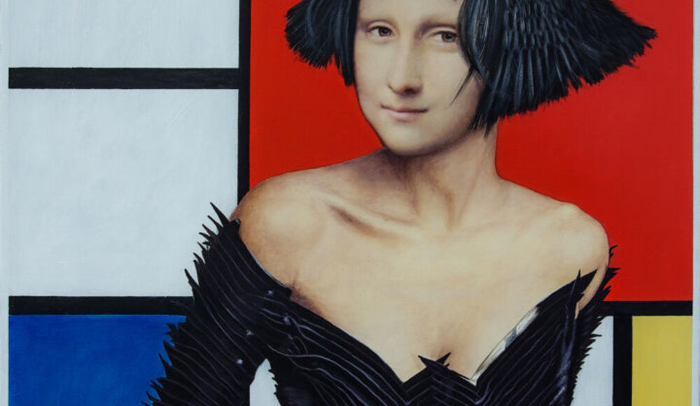
 Michael Cheung, Composition with red, blue, and yellow retro, 2022. Acrylic on canvas, 60 x 60 cm.
Michael Cheung: Composition with red, blue and yellow retro
The work by Artmajeur artist Cheung repurposes, in a figurative version, one of Mondrian's most celebrated neo-plastic masterpieces, Composition with Red, Blue, and Yellow (1930). In fact, in this original and unique version of the aforementioned canvas, the Dutch master's geometries have generated an interior, in which there is not only the walls and a yellow object, arranged in the foreground on the left, but also the figure of a woman, whose identity remains concealed behind thick hair, who is arranged on refined and elegant red dresses. In this new context, the work takes on unedited meanings, becoming associated with the more typical depictions of interiors with figures, aimed at immersing us in people's private lives. Speaking of Mondrian's masterpiece, however, the 1930 painting includes the chromatic use of red, blue, yellow, white and black, gathering them within a composition reduced to the simplest rectilinear forms of the square and rectangle, which are defined through vertical and horizontal lines. Such language is indicated to by the artist himself as "composition," as the organization of abstract and asymmetrical forms on the canvas, concretizes the synthesizing of universal forces.
 Olimpia Gaia Martinelli