Windows 8's new user interface has proven nothing short of polarizing. The hybrid operating system pairs a new GUI concept, the touch-friendly Metro interface, to the traditional windows, icons, menus, and pointer concept that Windows users have depended on for decades. In so doing, it removes Windows mainstays such as the Start button and Start menu.
While few are concerned about Windows 8's usability as a tablet operating system, desktop users remain wary. Will the new operating system take a huge step back in terms of both productivity and usability? Specific concerns voiced in our forums have included the mandated fullscreen view and a lack of resizable windows, the tight restrictions on what applications are permitted to do, and the automatic termination of background applications.
The good news is that these specific criticisms are largely off-base. Windows 8 includes a full desktop with all the applications and behavior that you expect a Windows desktop to include. This means full multitasking (no background suspension or termination), full system access (to the extent that your user permissions allow), resizable non-maximized windows, Aero snap, pinned taskbar icons, alt-tab—it's all still there and it all still works.
The bad news is that the various pieces of the operating system do not in fact mesh together smoothly; the seams, especially between the Metro and legacy interfaces, remain obvious and jarring. For desktop users, the experience remains decidedly mixed.
Let's run through the most common interface elements and see how Windows 8 fixes old problems—and creates new ones of its own.
A "Start menu" for the tablet age
The behavior of Windows 8 when running and switching between applications has not changed much. When it comes to launching applications, however, the changes are unavoidably in-your-face.
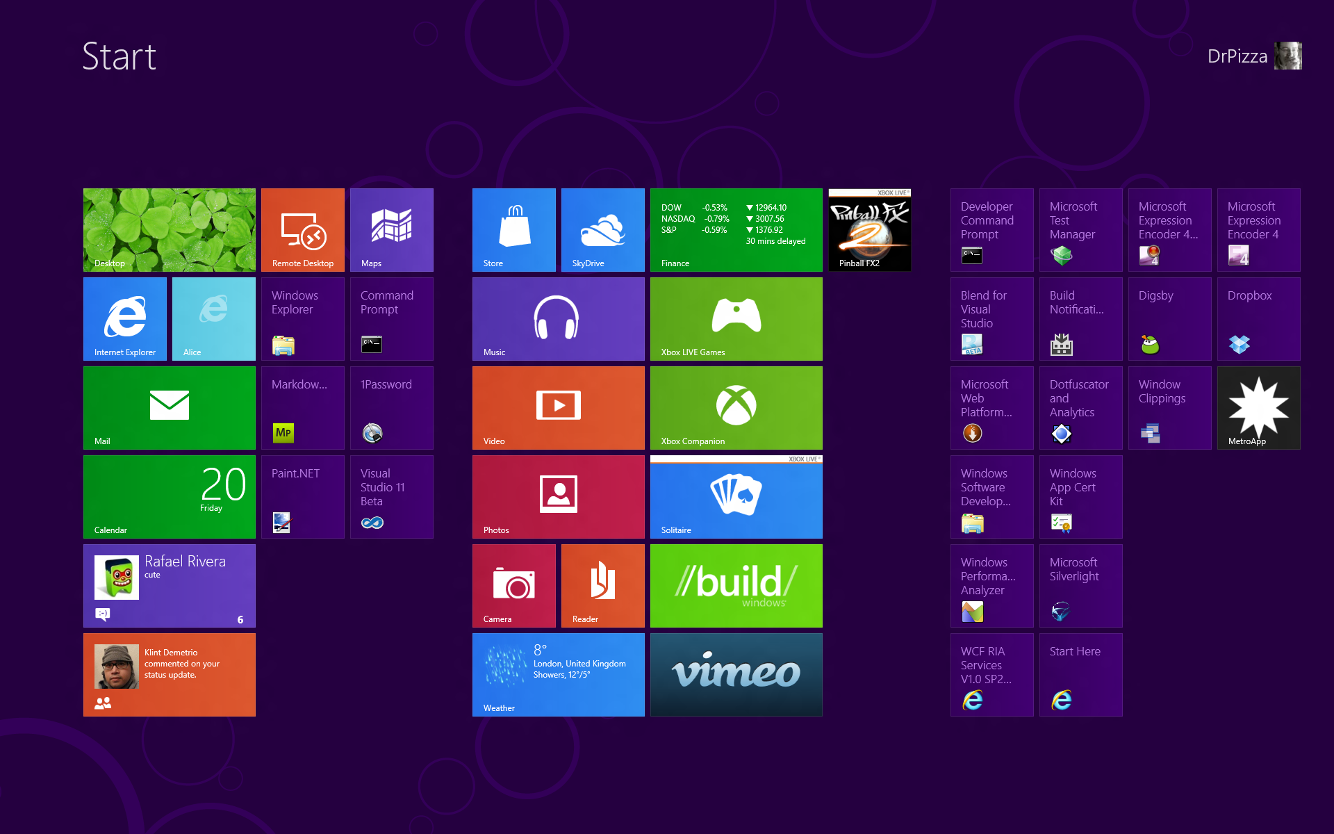
Instead of the Start menu, we have the Start screen. Depending on your screen resolution, the old Start menu occupied somewhere between a hefty chunk (about a third or so) and a small portion of the screen. If you use Windows 8, you can't help but use the Start screen; the system even shows it immediately after you log in. (This is configurable; you can elect to show the desktop instead, and Windows Server 2012 boots to the desktop by default).
The Start screen and Start menu exist to do essentially the same thing. Although their presentation differs, they both launch programs. Both split those programs into two "kinds," a limited selection of pinned or promoted programs and a comprehensive "all programs" view that contains all applications installed.
The traditional Start menu doesn't just depend on pinned programs. It devotes much of its space to programs that you use regularly, using some algorithm to determine which applications make the grade and in which order they appear. On the one hand, this means that the Start menu is automatically populated with icons for programs that you use often. On the other hand, its appearance becomes unpredictable—applications can bubble up onto the list or drop off out of sight. The pinned area, controlled by the user (applications can't pin themselves on installation), remains more controlled.
The Start screen has no recently used feature, but it allows a much greater number of applications to be pinned and positioned in 2D space. This makes it more predictable—the system won't discard a program icon unexpectedly because it thinks you use something else more often—but it also means that more care must be taken to actually organize the page the way you want. Applications also get pinned automatically when installed.
This can be a little unfortunate when installing large desktop applications, as many of them dump a whole load of icons onto the Start screen. Given the way that the Start screen's layout is both personal and customizable, this is a little offensive; I would prefer to see a kind of optional synthetic group that contains most-recently-used applications and that picked up newly installed programs in the way that the Start menu does. Everything outside this group would retain the position and layout that I specified, restricting the randomness and icon spraying to one specific section of the Start screen.
Organizing the pinned icons is also a little weird. Although it doesn't immediately look this way, each group on the screen is internally made out of columns. Each column is the width of a wide tile. You have to fill up one column with a mix of narrow and wide tiles before you can move on to the next column. This can make organizing the tiles the way you want a bit harder than anticipated. It absolutely prevents certain layouts from being constructed, too—a wide tile can't span two of the invisible columns.
Microsoft may have some secret rationale for doing things this way, but if it does, I don't know what it is.
All Programs
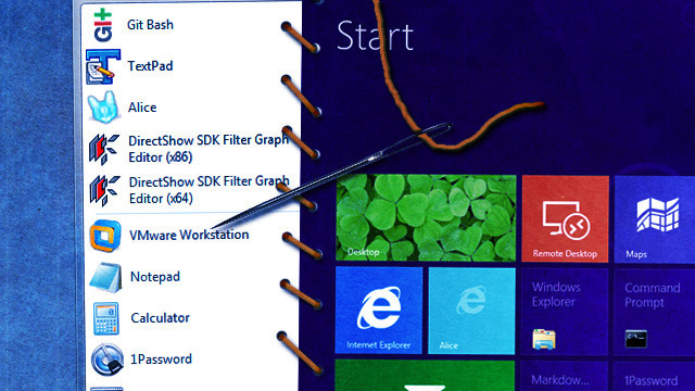
For programs that aren't accessible from the main screen, both the Start menu and Start screen make you delve into "All Programs."
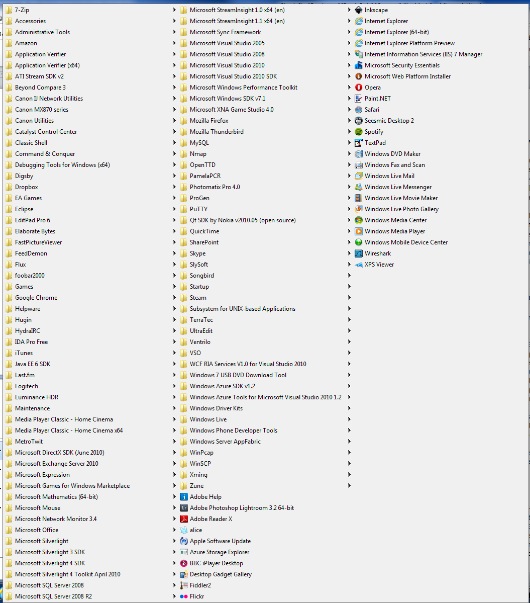
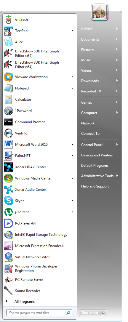
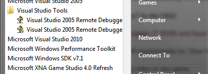
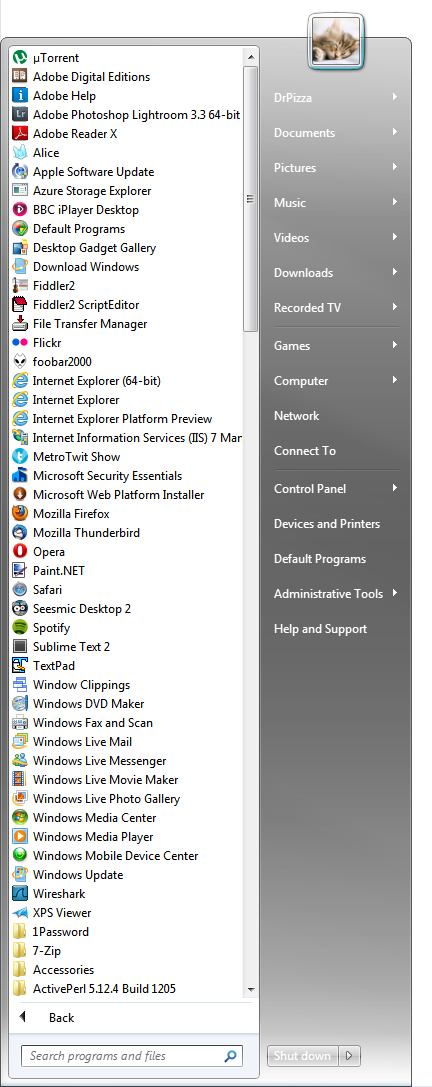
All Programs has never been much fun. In Windows XP and below, the regular flyout menus scaled atrociously. Systems with lots of software installed would have menus so tall that they filled the entire screen and then some, spilling into multiple columns. This was particularly exciting when you had so many entries that they ran into the right-hand edge of the screen, at which point they started opening to the left.
Windows Vista and Windows 7 took a step backwards with a weird "in-place" scrollable menu that prevented you from even seeing the whole set of installed programs at once. It also pulled awesome stunts like "not letting you see the name of the program you want to open."
The Start screen's All Programs—or rather, All Apps, as every program is now an "app" these days—takes some steps forward and some back. It makes better use of space than the menus in Windows Vista and Windows 7, especially as the Start screen supports "semantic zoom." But it can still be unwieldy if you have an enormous number of programs installed. At least it doesn't degrade into backwards-opening menus the way Windows XP could, but it will unfortunately still truncate program names.
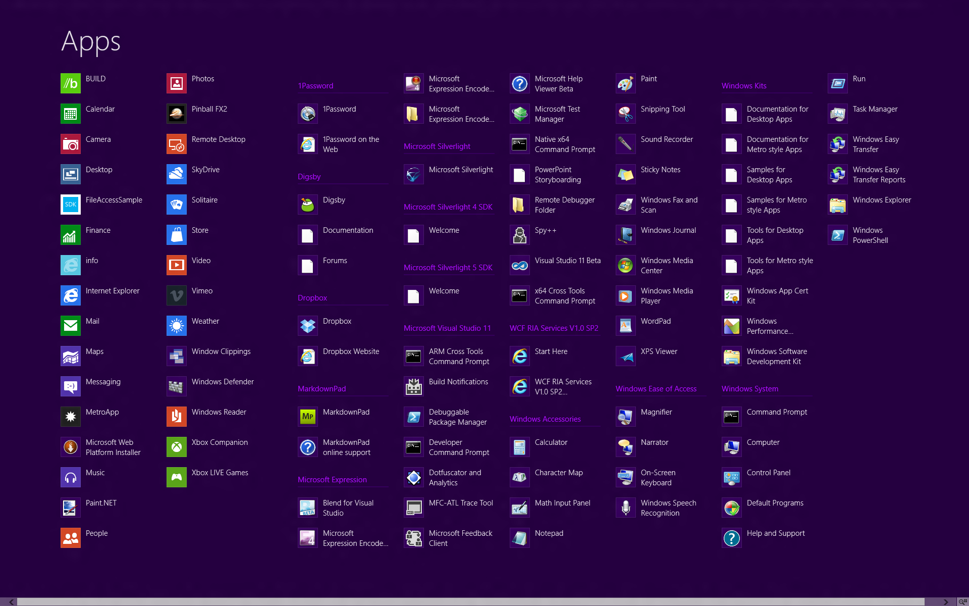
Overall, it works quite well, but it has one peculiar drawback that might just be an oversight: there's apparently no way to dismiss it. If you decide that you want to back out and return to the regular start screen, there's no "back" button (as in the Windows Vista and Window 7 Start menu) or other provision to revert. You can use the standard system features to bring up the Start screen—the charms or the Windows key or the hot corner—but to me, at least, this feels unnatural. All Apps is, logically, a part of the Start screen, just a sort of different mode. I don't intuitively expect the charms to undo that mode switch.
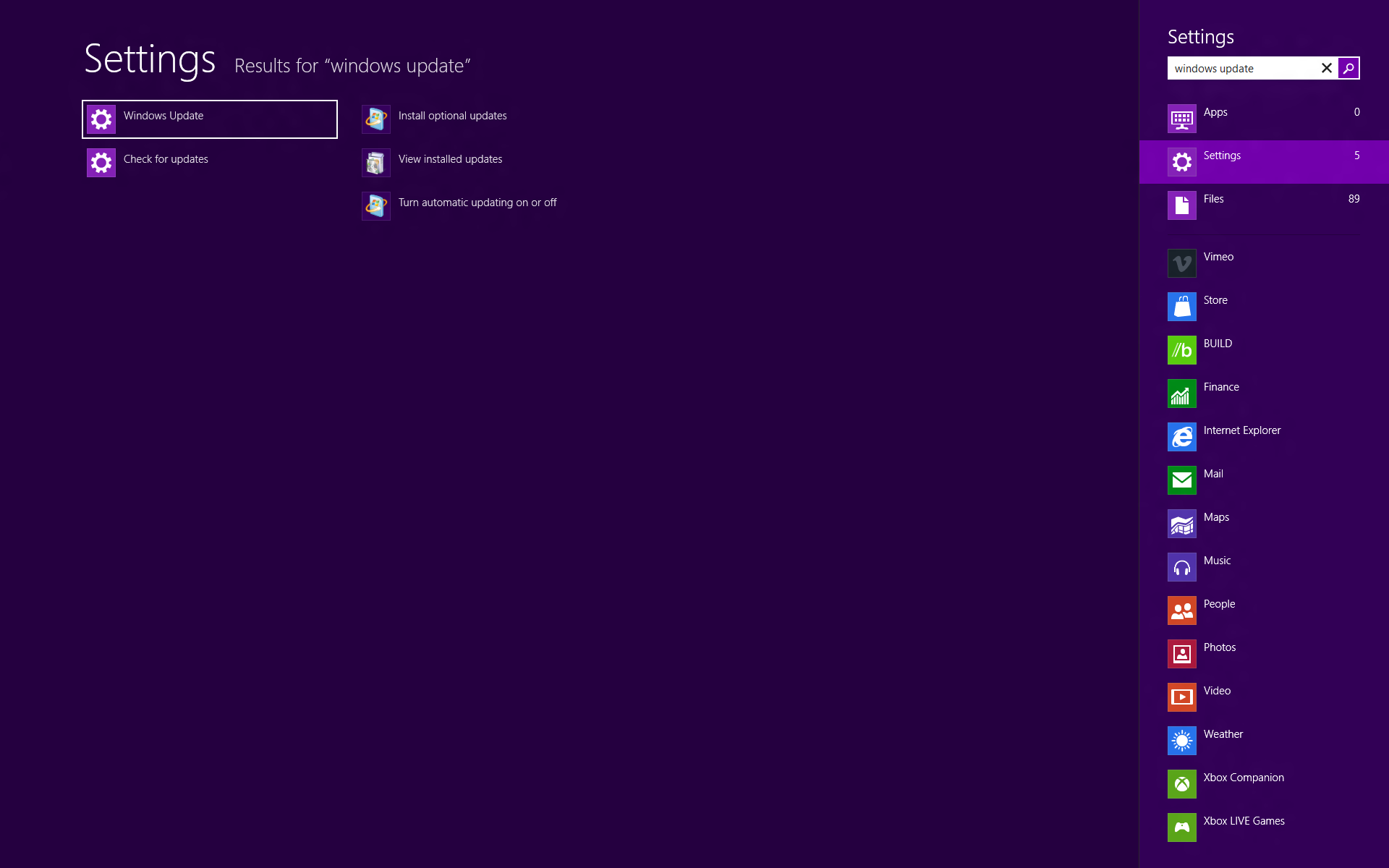
The solution that Microsoft provided to the way the Start menu breaks down with large numbers of applications is search. Start menu search works in Windows 8 in much the same way as it does in Windows Vista and Windows 7—on the Start screen, you just start typing.
There are some differences, of course. The searchable Start menu was configurable, so you could enable integrated whole-system search results and use it as your one-stop shop for computer searching. I did this and grew to depend on it.
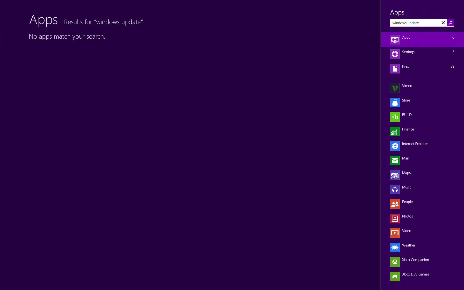
Not so with Windows 8, which has three filtered search views ("apps," which is the default, "settings," and "files"). If you really want to search files rather than apps, you have to type your search term, hit tab to switch the focus to the right-hand bar, then down arrow to select files, then tab again to move to the file selector. Sure, you could use the mouse, but the great joy of searchable Start is that you don't have to lift your hands from the keyboard. The lack of customizability is a great shame; I would much prefer to have a "search all" that grouped its results into apps, settings, and files.
As different as the Start screen looks, it performs the same function as the Start menu, and it performs it in substantially the same way. Some problems it solves a little better, some a little worse, but what it doesn't do is require any great shift in how programs are launched.
The fullscreen issue
Operationally, the Start screen and Start menu are similar, with the major functional areas of the Start menu having direct counterparts in the Start screen. One aspect of the Start screen's appearance, however, raises hackles: like everything else Metro, it's fullscreen.
When the Start screen is up, you can't see anything else on your primary monitor. This provokes two complaints: it covers up things people want to look at, and it's jarring to have the major switch.
Both of these are true, but how problematic they are is less clear. The Start menu is already always-on-top and in the foreground, meaning that it covers up a big chunk of the screen anyway. As with any other menu, once you click away it collapses. This greatly limits what can be done while the Start menu is open. You can't, for example, open the Start menu, then click in an e-mail or on a Web page without also collapsing the menu. It might not be possible to simultaneously use an app while the Start screen is open, but the same is in practice true of the Start menu.
As for the "shock" from switching to a fullscreen Start screen, the impact of this will depend greatly on how you use your computer. If your windows are mainly maximized (or at least large) then it's not so very different from simply switching between two windows. The Start screen might be a little more colorful than a Word document, say, but it's hardly a standout among webpages, media players, or even a lot of e-mails.
Those who like lots of smaller windows will find the fullscreen Start screen more unwelcome. It shouldn't change how they use their computers at all, since as soon as they launch an application the Start screen will go away, but it certainly doesn't fit with their preferences.
The fullscreen approach also has implications for usability. In general, targets are easier to hit the larger they are, and they're easier to hit the closer they are to the pointer (that is, small mouse movements are more accurate than large ones). The Start menu's targets are all relatively close to the mouse, but are relatively small in one direction (wide, but not tall). The Start menu makes its targets bigger, but because they're spread across the full width of the screen, they're further away.
Microsoft argues that the new design is, overall, a net win: although you have to move the mouse a little further, this is more than offset by the larger targets, producing targets that are easier to hit. In practice I haven't found it to matter; I could hit the targets on the Start menu easily, and I can hit the targets on the Start screen easily.
Only for tablet users?
The Start screen's design has plainly been influenced by the need to cater to tablet users. Big targets, fullscreen graphics, panning, zooming, and a move away from a traditional menu—these all meet the needs of touch users.
Is that a problem for desktop users? I don't think so. The new design may have been driven by the needs of touch, but it doesn't make the mouse any worse, and in some ways makes it better. I think pinned programs work better with the Start screen, and the All Programs view doesn't degrade quite as horribly as the old Start menu when filled with hundreds of icons. It's not all good; in particular, I miss the automatic promotion of recently used items. But it works, and for the most part, it works well.
It's not perfect, but neither is the Start menu. Having used Windows 8 quite a bit for a number of weeks (not quite full-time, but routinely, for hours each day), I think the Start screen works at least as well as the Start menu ever did. Once Windows 8 Metro apps become more abundant and my pinned apps thus become more useful, I think the Start screen will be a clear winner.
reader comments
318